sellers' activation
company
avito
industry
classified
date
apr 2026
Avito is the largest C2C and B2C classifieds platform with an audience of over 50 million active users.
Despite its scale, a significant portion of the audience has never acted as sellers. This created an obvious growth opportunity: by lowering the barrier to entry for sellers, it would be possible to increase the number of sellers, expand the product range, and influence turnover.


Our category already had over 60 million active listings, but some of them were illiquid items. At the same time, the process of submitting a new listing consisted of more than 20 steps. Formally, the funnel was high (98.5% completion rate), but qualitative research showed that the complexity of the process itself was a psychological barrier for new users.
Additional insight from surveys: many users do not perceive their belongings as assets. They do not consider selling them and are more likely to dispose of them than to place an ad.
I identified two problems:
The complexity of getting started.
Lack of awareness of the value of belongings.

task
I had to design a mechanism that would:
Lower the barrier to entry for sellers,
Increase the number of new sellers,
Bring in an incremental liquid assortment,
Influence sales and DTB.
We agreed to proceed iteratively: first, quickly test the basic hypothesis, and then scale the solution upon confirmation of the data.


test the basic hypothesis
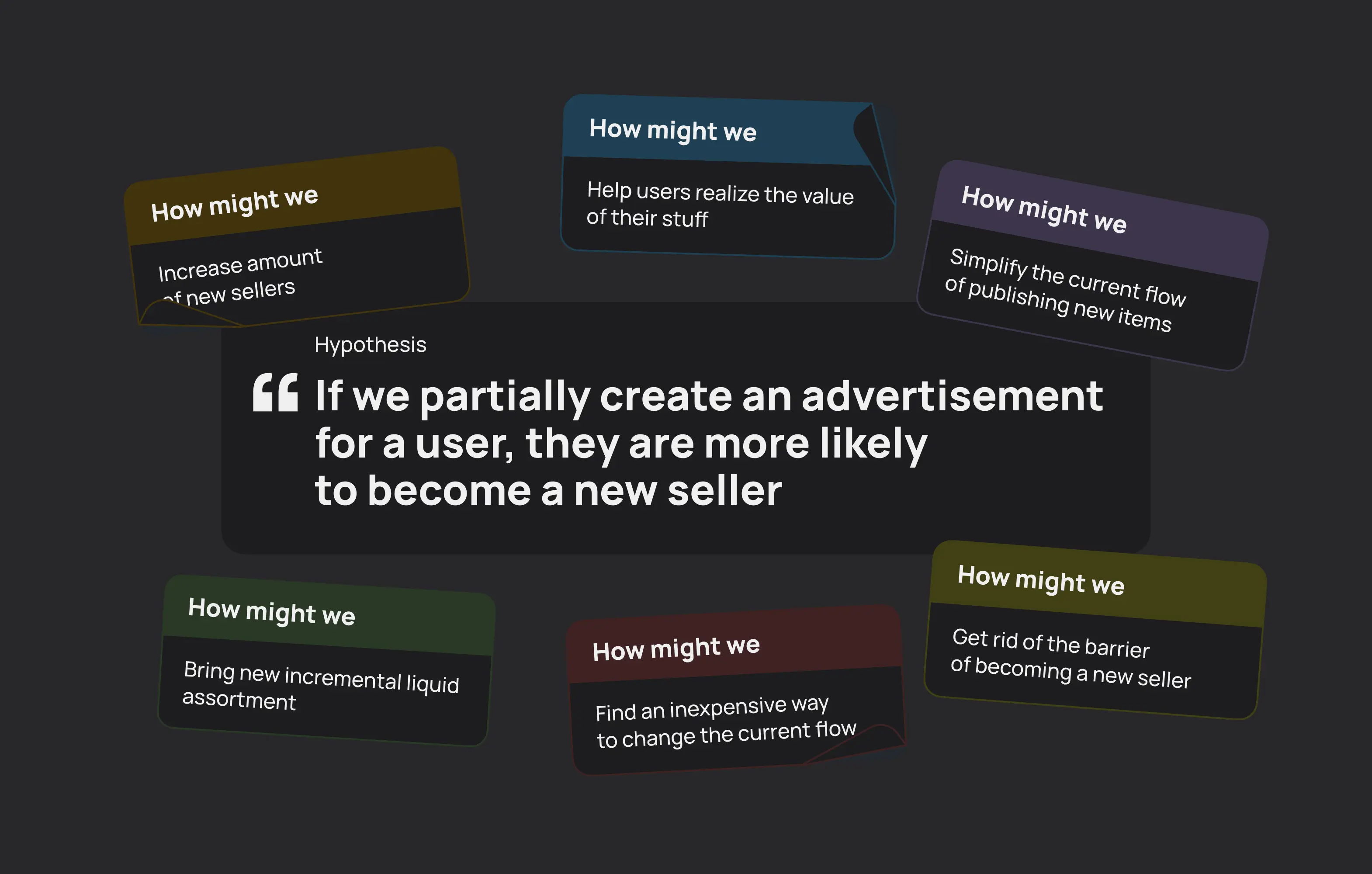
Based on the CJM audit and quantitative surveys, I formulated a key hypothesis: If we partially create an ad for the user, they are more likely to become a seller.
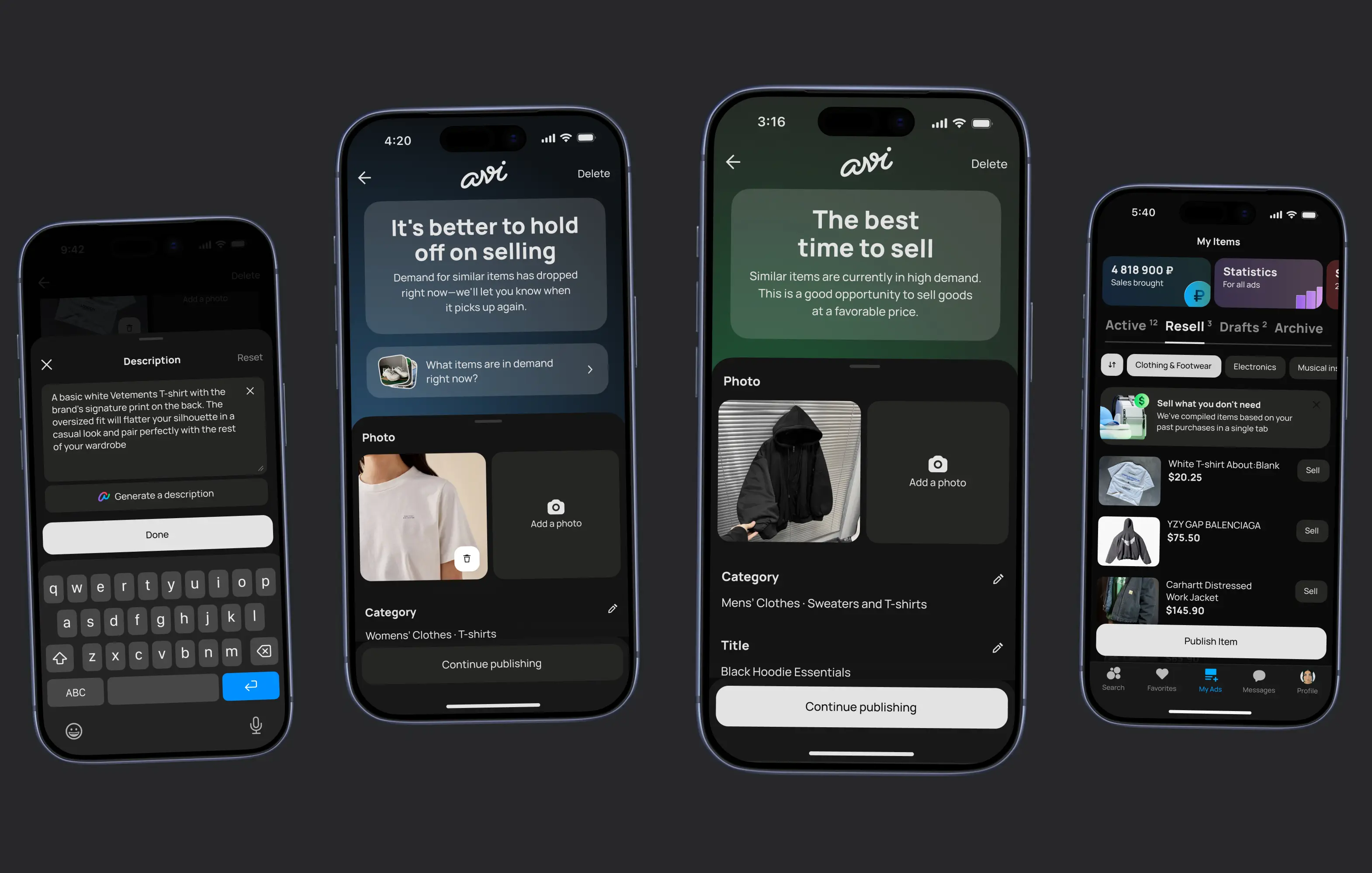
I suggested starting with the mechanics of reselling previously purchased goods. The logic was simple: if a user had already made a purchase on the platform, we could pre-fill the ad and thus eliminate most of the manual input. I designed the MVP, relying as much as possible on existing design system patterns.
This allowed us to:
Reduce the amount of new logic,
Speed up development,
Quickly move to A/B testing.
During interviews, an important problem emerged: users confused drafts with active ads. This affected their understanding of the status of the listing.
We deliberately decided not to redesign the architecture before the first test — the priority was to test the main hypothesis, not to perfect the interface.
The test was run on 100k users over the course of a month.


result
We saw a statistically significant increase in the number of new listings and confirmed that reducing cognitive load really does encourage users to become sellers. However, the data revealed a problem that had been identified earlier in interviews: some users stopped between creating a draft and publishing it due to confusion about statuses.
The hypothesis was confirmed, but it became clear that the UX needed refinement. After discussing the results at the business level, the project received further funding.


iteration and reinforcement of the solution
In the second stage, the focus shifted from testing the idea to optimizing conversion and product range quality. I redesigned UI of the summary page: I changed the layout, added visual accents, and deliberately made the Summary Page look different from the draft so that users would stop confusing them.
Additionally, a system for evaluating the value of items and a liquidity determination module were added, which allowed only relevant assortments to be displayed. This was an important step: we weren't just increasing the number of listings, we were controlling their quality. Technically, the functionality was implemented through BDUI architecture, which allowed us to make changes without regard to the release cycle and speed up iterations.
After a series of unmoderated tests and refinements, we launched a second A/B test in a similar setup.

result
The second version showed more pronounced growth in new listings and an additional increase in sales conversion compared to the first iteration.
Thus:
The first version confirmed the viability of the hypothesis,
The second proved that UX optimization significantly enhances the effect.
The project was defended at the investment committee, received further development, and became the basis for scaling to other categories.


For me, this case study is an example of a two-stage product approach: first, we quickly tested the key hypothesis at minimal cost, and then systematically refined the solution based on data, which strengthened the metrics and created a solid foundation for developing functionality.
I participated in generating the hypothesis, designed the solution architecture, took informed risks at the MVP stage, and then reworked the UX based on data, which allowed us to turn the experiment into a scalable product tool.
more projects

© Khlestkin 2026. All rights reserved